Jetpack Compose: Styles and Themes (Part II)
If you're new to Jetpack Compose and looking at all the cool UI screens and animations around the internet like me, you're probably a bit overwhelmed but also curious about how things work in compose.

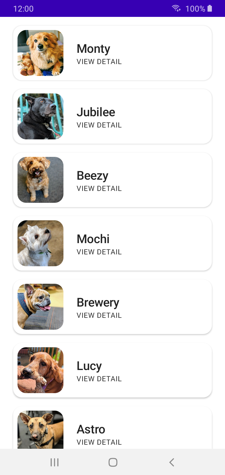
As of Part I, we successfully implemented a RecyclerView (known as LazyColumn in Compose), populating it with a list of puppies that we have for adoption. 🐶
But as I mentioned, we still have some things to do before we call it a complete Compose app. The two things left now are:
- To style the app to our final look.
- To implement a detailed view screen.
In case you’re not fond of reading blog posts, I’ve also turned this 4-part Jetpack Compose series into a 13-minute speed code video with some laid back music for you to watch and relax to! 😊
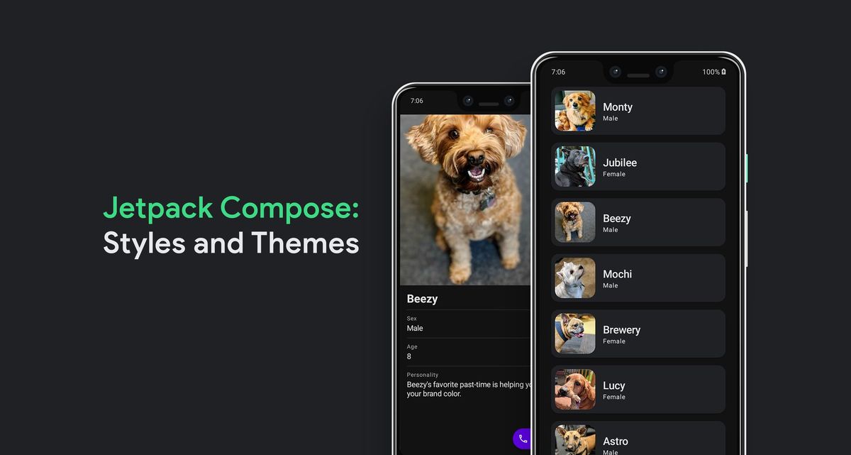
In this part of the series, we'll look at how styles and themes work in Compose, taking our app from Part I and giving it the final look that we want to achieve:
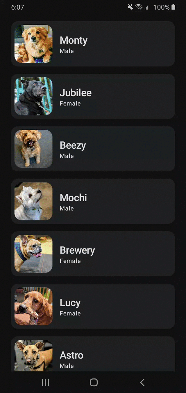
To look at where we need to continue from, let's first look at the final screen from Part I:
The things we're going to look at:
- Change color throughout the app using
Color.ktandTheme.kt. - Look at how dark/light mode works in Compose.
- Fix status bar and system navigation bar to adapt to our app's theme.
Let's get started!
Previous Post
 Waseef Akhtar
Enabling Dark Mode 💡
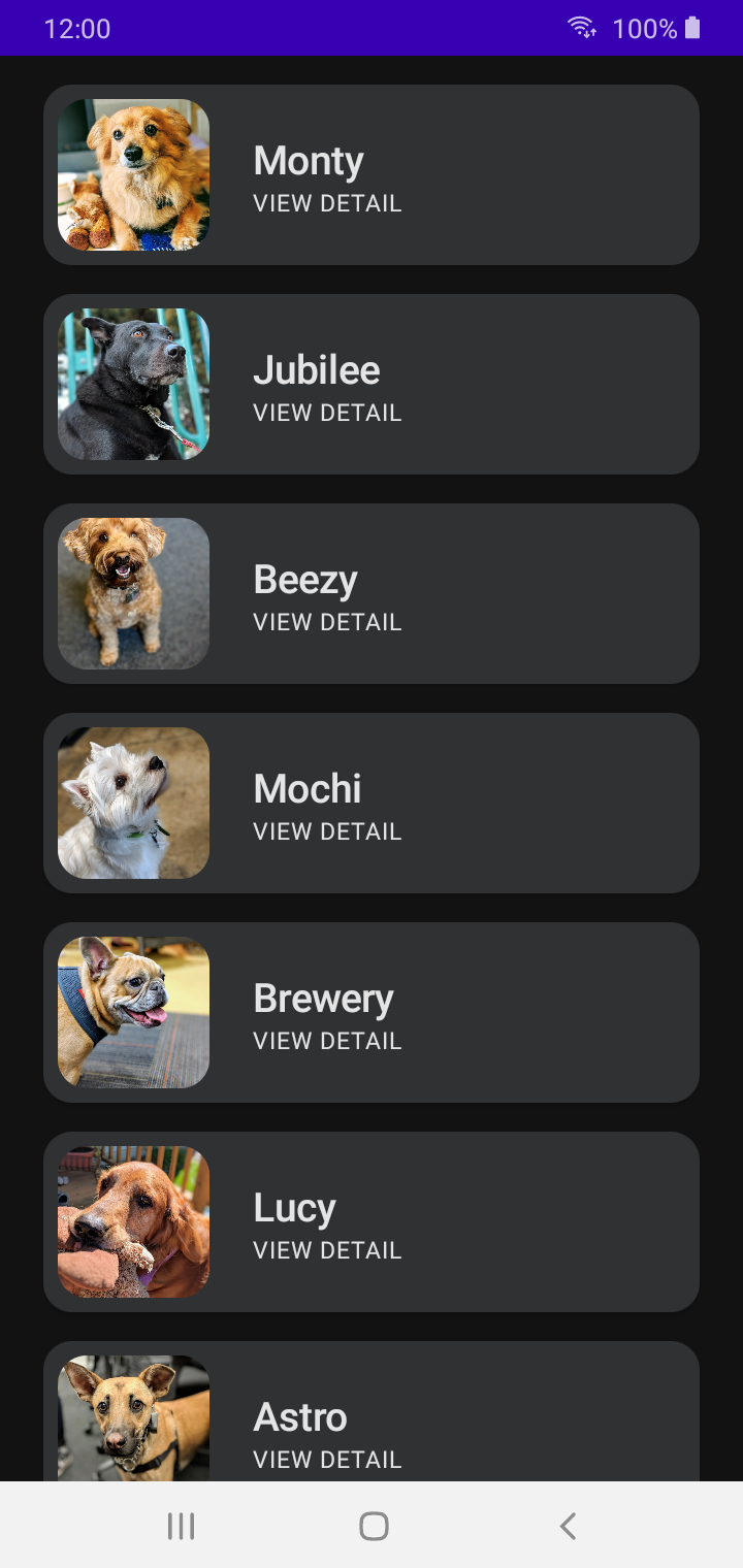
As you can see in our final screen, our app looks like it has dark mode enabled. If that's the final look we want (or if we want an app that has support for Dark mode), it's super easy with how our project is set up initially by the Android Studio template. Let's explore a bit more to see what we mean.
If you open you project directory, you can see that you already have /ui/theme directory and inside that, you have a few Kotlin classes: Color, Shape, Theme, Type.
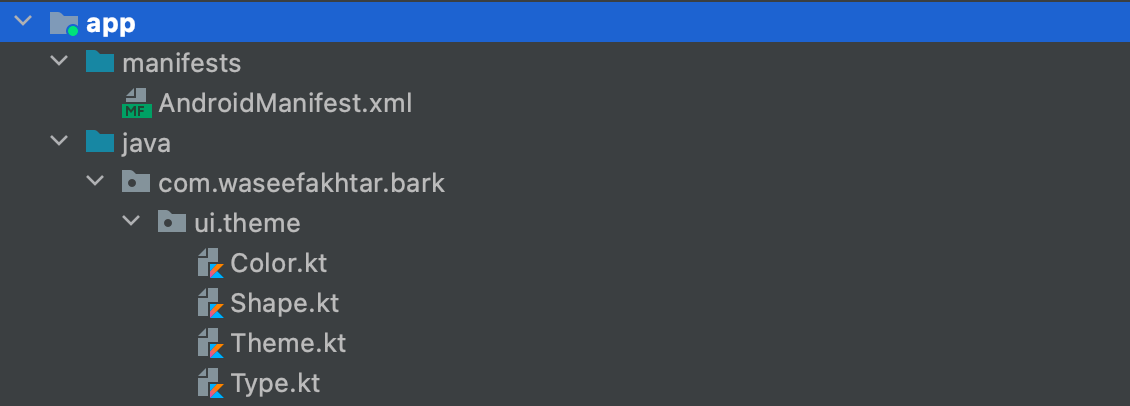
These are all the classes that you need to modify the theme and styling of your app.
Since in our case, we need to enable dark mode for our app, do the following:
- Open
Theme.kt. - Inside
BarkThemecomposable, replace the darkTheme default value fromisSystemInDarkTheme()totrue.
3. Run the app to see the changes.
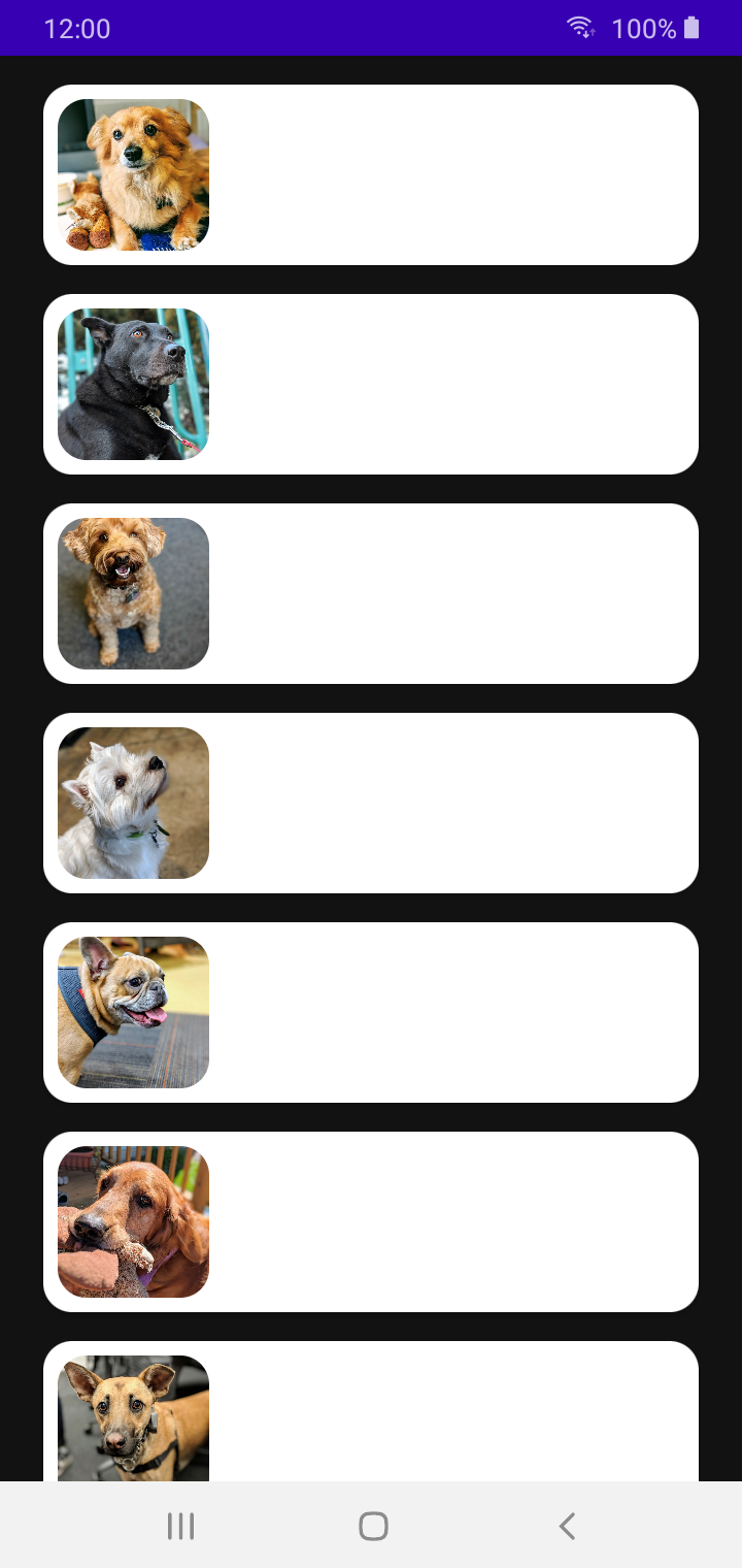
We can see that our background has changed.. but, with that, we also have our text color changed but not the puppy card color.
Let's quickly fix that:
- Open
Color.kt. - Add a new color named
graySurface.
3. Now open Theme.kt.
4. Inside the DarkColorPalette variable, add a new color definition for surface and set its value to the graySurface color that we set in #2.
Note: In case you want to know what surface is, it's a color definition provided by the color system of Material Design that affect surfaces of components, such as cards, sheets, and menus: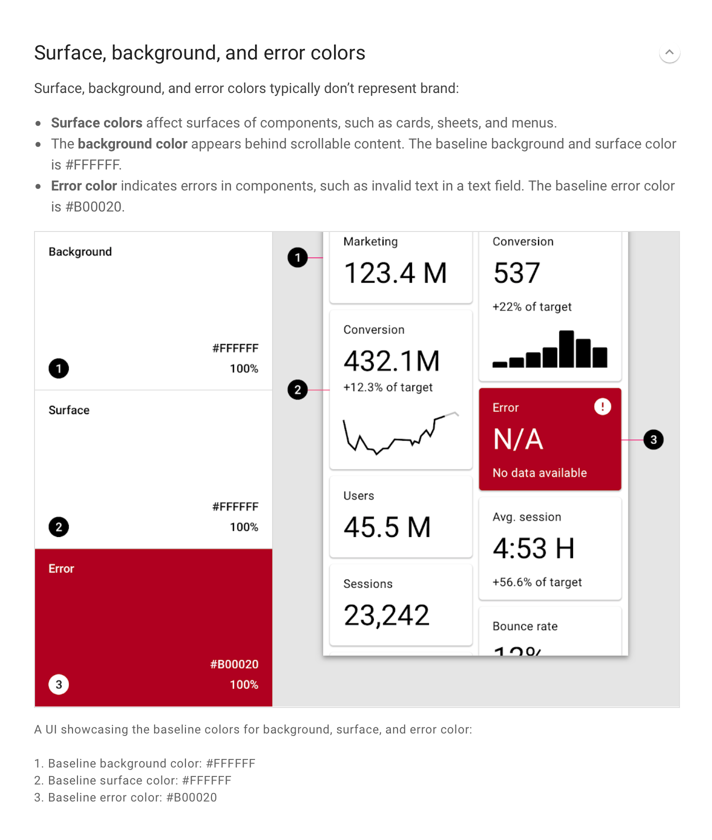
5. Finally, if you've been following the tutorial step by step, you might remember that we hardcoded our card color when we implemented it in Part I, which is not really a great way of doing it. In order to let our app color values from Color.kt work consistently throughout the app, it's always a better idea to change the color values of the UI elements using Color.kt rather than changing each UI element's color individually.
So at this step, we remove that hardcoded color from our puppy card in order for the card to show the true surface color we just set.
- Open
PuppyListItem.kt. - Inside
PuppyListItemcomposable function, remove this parameter from the Card composable:backgroundColor value: backgroundColor = Color.White
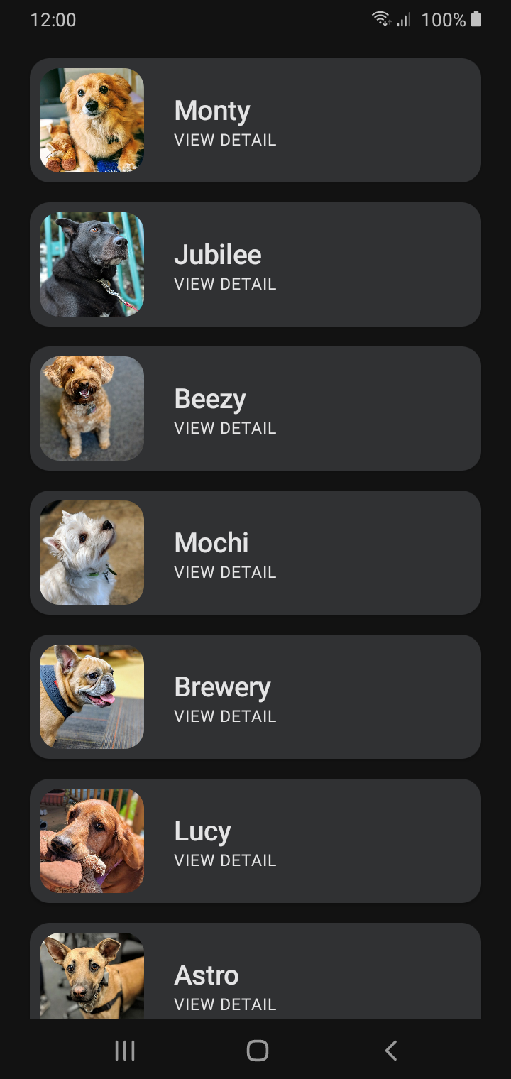
Run the app now to see the changes.
Super! We've done everything we needed to do at this time.
But..
Do you see that the status bar looks a bit odd at the top with that odd color? And what about the system navigation bar at the bottom? It'd be extra cool if we fixed them to match our overall theme.
But there's a catch. Since Jetpack Compose is still early to work with, it comes with its limitation for the time being (And I'm not entirely sure if there even is this particular limitation). So to fix the status bar and navigation bar, we're going to head to our dear 'ol XML for this.
The Final Fixes 👨🎨
In order to change the status bar color to match our theme:
- Open
colors.xmlunder/res. - Add the same gray color we added to our
Color.kt.
3. Open themes.xml.
Note: You might notice that you have two themes.xml in themes directory. Make it a good practice from now onwards to change the values in both these files whenever you're making a change because these two files refer to the dark mode and light mode theme of the app.4. Define the statusBarBackground attribute inside Theme.Bark and set its value to our gray color.
5. Now add this statusBarBackground attribute as our value for android:statusBarColor.
Now in order to change the system navigation bar's color:
- Open
themes.xml. - Add another item for
navigationBarColorand set its value to?android:attr/windowBackgroundattribute (which is a color value that changes automatically with system preferences)
Run the app now to see the changes.
And.. there you go! Thats our final look of the app! 😍
Give yourself a pat on the back at this point for having now learnt how theming and styling are done in Compose. 👏
Happy coding! 💻
Up Next
Waseef Akhtar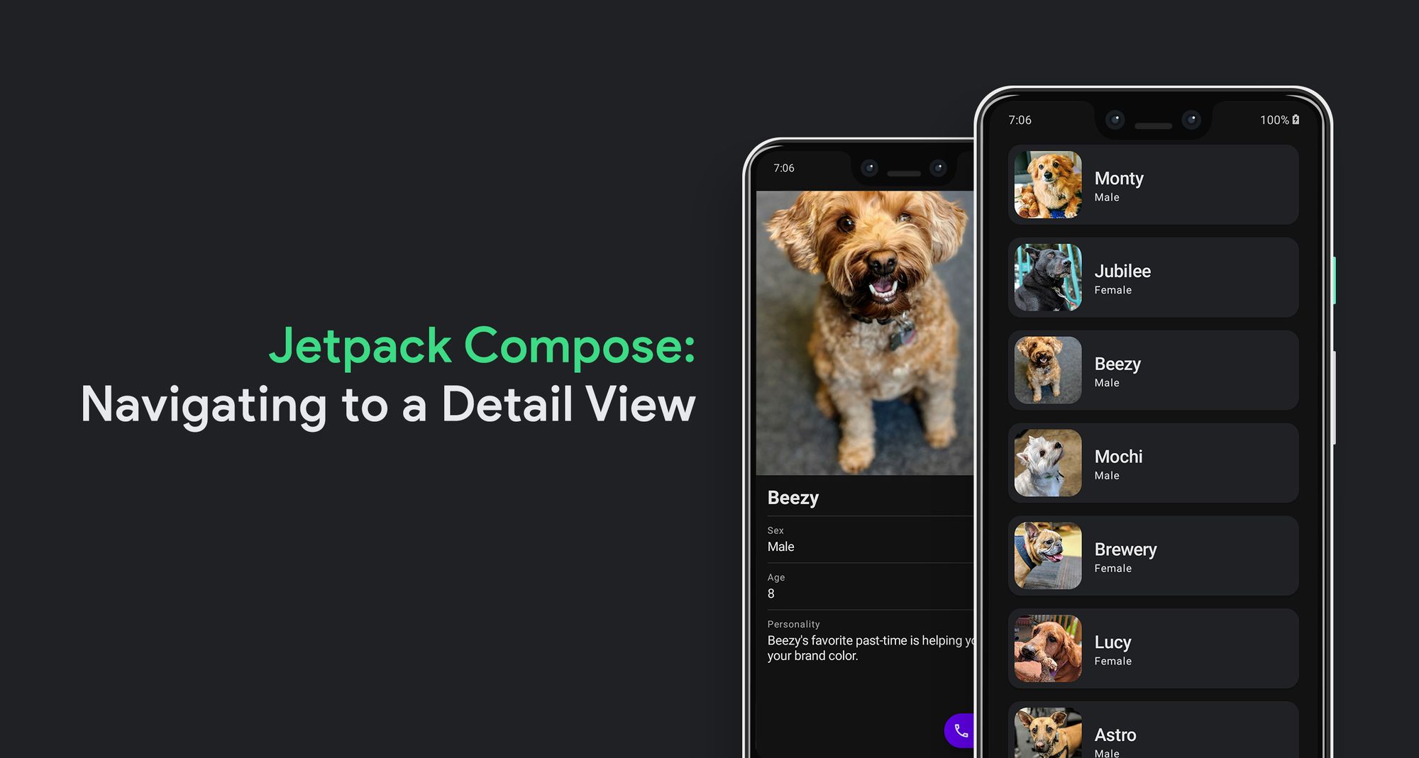
Source code for the Final Version
 waseefakhtar
Awesome that you came this far! 👏 Now I'd love to know what the most annoying part of this post was or if it was of any help to you. Either ways, you can drop me a DM on: www.twitter.com/waseefakhtar ✌️