Android Material Component: Navigation Drawer Styling (Part II)
The Navigation Drawer is a powerful component in Android Development which provide easy access to destinations in your app. But if you’ve come to this article, you probably know that and considering the title of the story, you’ve probably implemented it before.


The Navigation Drawer is a powerful component in Android Development which provide easy access to destinations in your app. But if you’ve come to this article, you probably know that and considering the title of the story, you’ve probably implemented it before.
If not, it’s best to first go to the first part of this tutorial for an easy approach to Navigation Drawer in Kotlin since this part of the tutorial is based on that, but if you’re an intermediate developer, you’re welcome to skim through it.
Previous Post
 Waseef Akhtar
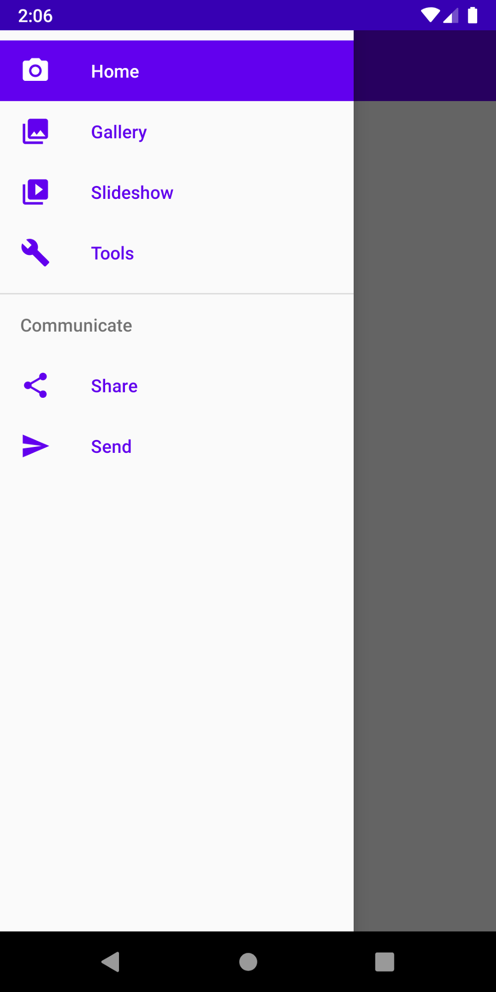
Here’s the recap of what we’ve achieved in the first part:

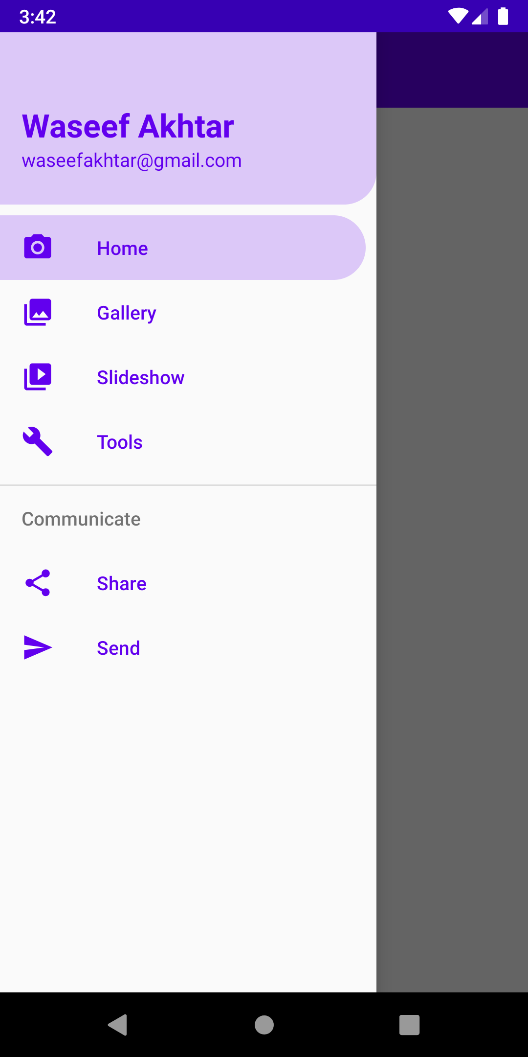
And if you follow along, by the end of the series, you’ll have a screen looking like this:
Note
In addition to styling, this tutorial also provides the best practices of using colors and resources, i.e. via attributes like ?attr/ and never on the UI component directly but through styles.
- The advantage of using
?attr/in calling colors and color states is because of reasons like making it generic so it’s easy for us to either change our brand colors in the future, so adding a new theme for our app (for instance, to support Dark/Light mode) - The advantage of using styles is to unify the styles for each UI element so every time you add a new UI element (for instance, a Button or a TextView), you can call a style attribute to apply all the UI changes for that particular element you’ve applied in other places to be consistent with your style/brand throughout the app.
To read more about themes and styles, please go to these wonderful articles by Nick Butcher:
 Nick Butcher
 Nick ButcherNick Butcher
Styling: itemIconTint, itemTextColor, itemBackground
If you’ve noticed, there are a number of states for each item in the Navigation Drawer (for instance, selected, pressed, hovered, etc) and to make the app visually appealing, you have to think of all the states the item goes through when a user clicks on it. And since each item is made of several elements (icon, text, background), you have to think about the states of each element to apply styles to. So to begin styling them:
- Add a new attribute to res > values > attr.xml (Create the file if you don’t already have it added and make sure to name it exactly) and add the following lines:
2. Add a new Color Resource File in res > color (Create the color directory under res if you don’t have it already and make sure to name it exactly) with the name menu_item_color_state.xml and add the following lines to define the color states for the menu item’s icon and text:
3. Add a new Drawable Resource File in res > drawable with the name menu_background_color_state.xml and add the following lines to define the color states of item background color states:
4. Open res > values > colors.xml and add the following line for the new icon and text color for when an item is selected:
5. In your styles.xml, set the attributes value with the colors and drawables we just added inside the app base theme (usually goes by the name AppTheme):
Note: Make sure that you add a drawable for menu item background in res > drawable and a color for menu item in res > color. At the time of implementing it the first time, I spent plenty of time just because I did not bother about adding the right resource file for each style.
6. Add a new style in styles.xml below the base theme:
7. And finally add the style to our NavigationView in main_activity.xml:
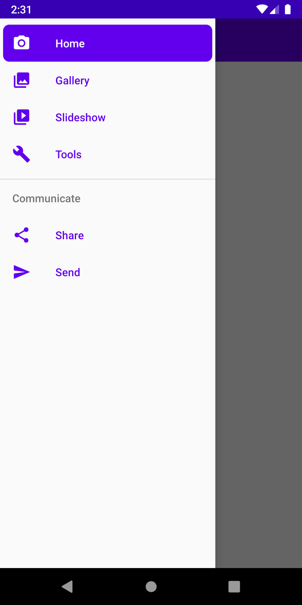
Upon running the app, you should now see the new style of the drawer.
Styling: Menu Background Item
If you’ve noticed, we currently show a solid purple color for the menu item background color. But there’s a possibility that we can add our own shape as the background. In order to do so:
- Add a new Drawable Resource File and name it
background_round_padded.xml:
2. Open menu_background_color_state.xml and set drawable to android:drawable="@drawable/background_round_padded".
Upon running the app now, you should see the new shape of the background with added padding.
And with creating shapes for background, the possibilities are now endless! For instance here’s how you can modify the item background:
To achieve a look like below. 👇

And.. that’s a wrap for giving you an idea on styling the Navigation Drawer in this post!
Up next
Join me in the next post to learn how to add a header layout to our Navigation Drawer and how to style it.
Waseef Akhtar
Source code for the Final Version
 waseefakhtar
As always, let me know if my tutorial helped you in anyway and the things I can improve in writing tutorials by sending a DM or a Tweet at: twitter.com/waseefakhtar ✌️