Android Material Component: An easy approach to Navigation Drawer (Part I)
The Navigation Drawer is a powerful component in Android Development which provide easy access to destinations in your app. If you’ve come to this article, you probably know that and considering the title of the story, you’ve probably implemented it before.


The Navigation Drawer is a powerful component in Android Development which provide easy access to destinations in your app. If you’ve come to this article, you probably know that and considering the title of the story, you’ve probably implemented it before.
But since I want to help developers with different backgrounds and experiences, I would like to make this tutorial in three parts, and that is because at the time of writing this, I passed by a number of different articles implementing the Navigation Drawer in a number of different ways. So the three parts of the tutorial are really just:
- An easy approach to implementing Navigation Drawer (I do not claim this, so feel free to let me know if there’s an even easier approach 🙂), and
- Applying custom styles to the Navigation Drawer.
- Adding header view to the Navigation Drawer and styling it.
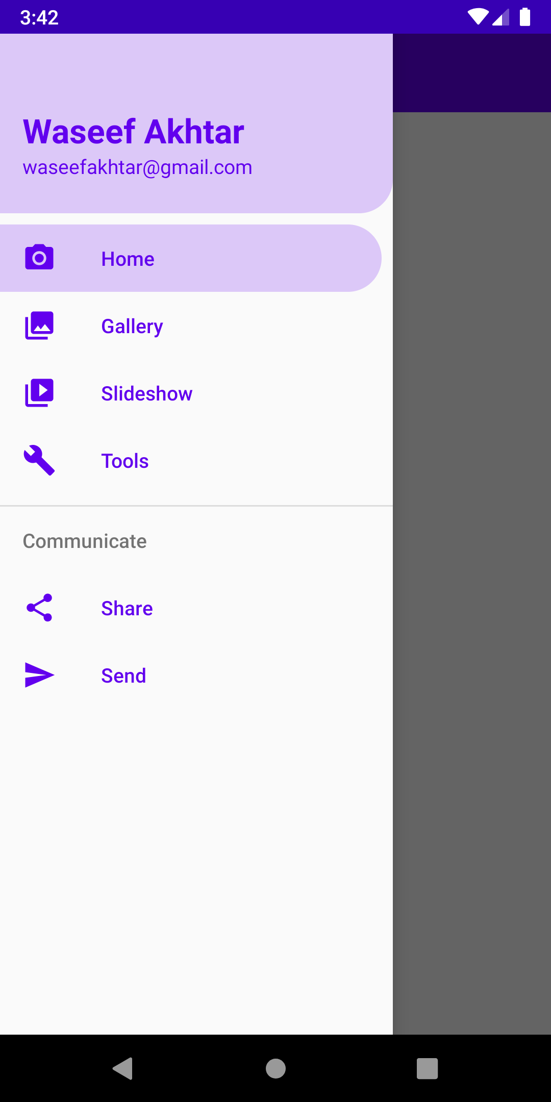
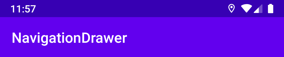
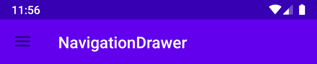
If you follow along, by the end of the series, you’ll have a screen looking like this:
So let’s begin.
Prerequisite ☝️
For this tutorial I’ve used Android Studio 4.0 Preview but things should work on other versions of AS as well.
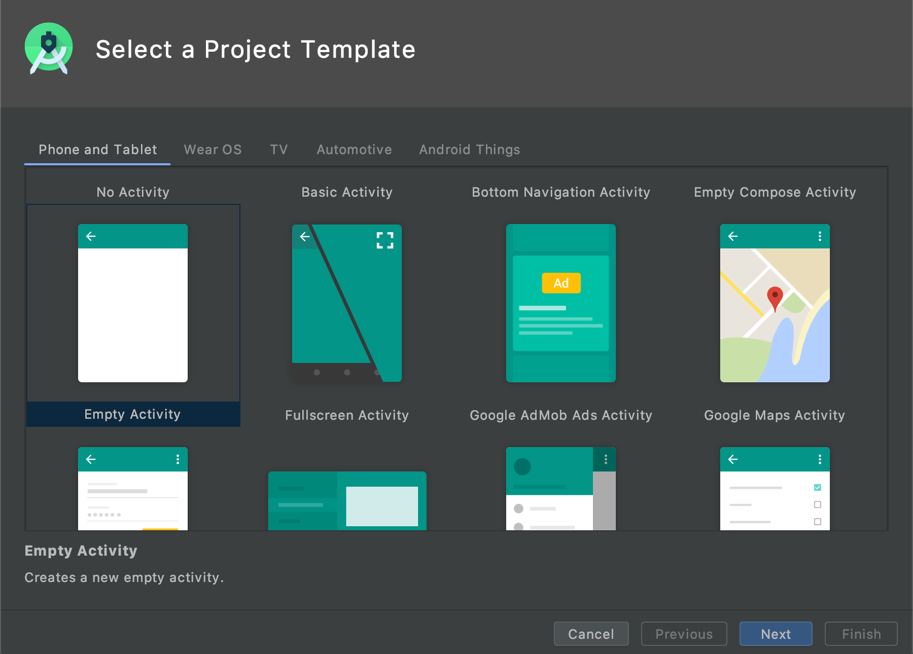
Project Setup ⚙️
- Open a new project.
- Select an Empty Activity Project Template. This would create an empty screen with an Action Bar.
3. Type any name for the project and select Kotlin from the language
4. Click Finish.
5. Run the project to see the look of your initial app.
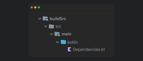
Material Dependency 😍
Since Navigation Drawer is part of Android’s Material library, first thing is to add the Material library to our project. To do so:
- Open
build.gradle (Module) - Add this line in the dependency section:
Note: At the time of writing, the latest Material version was 1.1.0, but you can use any latest stable release you want from Google’s Maven Repository or MVN Repository.
3. Sync the project.
Adding Toolbar and Navigation View 🖼
- Open
activity_main.xml - Change the parent’s layout to
androidx.drawerlayout.widget.DrawerLayout.
DrawerLayout acts as a top-level container for window content that allows for interactive "drawer" views to be pulled out from one or both vertical edges of the window.
3. Set the parent layout ID to android:id="@+id/drawer":
4. Inside the Drawer Layout, add the following code to add a Toolbar:
Note: You might be thinking if we already have a toolbar set up, why add another. It is because the default toolbar that’s set up by the project is from a parent layout that we do not have a control of, so the Navigation Drawer is always shown underneath the default toolbar when opened.
If you run the project at this moment, you might run into an exception:
java.lang.IllegalStateException: This Activity already has an action bar supplied by the window decor. Do not request Window.FEATURE_SUPPORT_ACTION_BAR and set windowActionBar to false in your theme to use a Toolbar instead.4. To solve this, open your styles.xml.
5. Replace your parent theme from Theme.AppCompat.Light.DarkActionBar to Theme.AppCompat.Light.NoActionBar (which should solve the exception and running the app now should display an empty toolbar).
6. Open main_activity.xml again and below the LinearLayout, add the NavigationView (which is basically our Navigation Drawer):
Note: At this point, you need a main_menu since that’s one thing that’s missing, which is basically a menu to display the items in the drawer, to create that:
7. Add a new Menu Resource File inside res > menu directory (If you don’t already have the menu directory, create that directory under res)
8. Inside the main_menu, add the following lines for a few items to be displayed inside the drawer:
Note: You might notice that you don’t have the icons and string resource for any of the items in the menu but the icons are okay to remove for now and give the title for each as you please. I’ve only done it to make the app a bit visually appealing.
At this point you’re done with the XML side of your app.
The Implementation (in Kotlin)
To breathe life into t he components you just added:
- Open
MainActivity.kt. - Add this line after
setContentView()to setup our own toolbar.
Note: Running the app at this time should show the title of the app in your toolbar.
3. To add the navigation drawer, while still inside onCreate(), we need to do a couple of things to make it work:
- Create a new drawer variable for the DrawerLayout we added in XML.
- Add an
ActionBarDrawerToggle, which displays the hamburger icon in the toolbar. - Add the toggle as a listener to our
DrawerLayoutso that it can animate the toggle upon opening and closing the drawer. - Sync the toggle so that it knows when to animate between a hamburger icon and a back icon.
Note: The ActionBarDrawerToggle need two strings resources which must be provided to describe the open/close drawer actions for accessibility services. So add open and close strings with any values in your strings.xml and reference them in the ActionBarDrawerToggle arguments.
Note II: At this point, running the app should display a hamburger icon next to the title of the app but it shouldn’t work when clicked on since we haven’t added any click listener to it yet.
Listen to the Drawer 👂
This should now be easy to achieve. To do so, simply add the following method after onCreate():
Note: The onOptionsItemSelected() helps in handling any action implemented in the toolbar. Since we only have one action (the navigation drawer), we call it through the already defined itemId by Android: android.R.id.home.
At this point you’re finally done and can interacting with the drawer by running the app.

Bonus 🎈
You might’ve noticed that when the drawer is opened, upon pressing the back button currently closes the app and not the navigation drawer, which is an odd behavior. To fix that, add the following method in MainActivity.
Up next
After implementing this, you might want to normally link the activities or fragments to each navigation drawer menu item but since you can discover plenty of articles to achieve that, what I want to write next about is how to apply custom styles to our navigation drawer and how far we can go with our styling.
 Waseef Akhtar
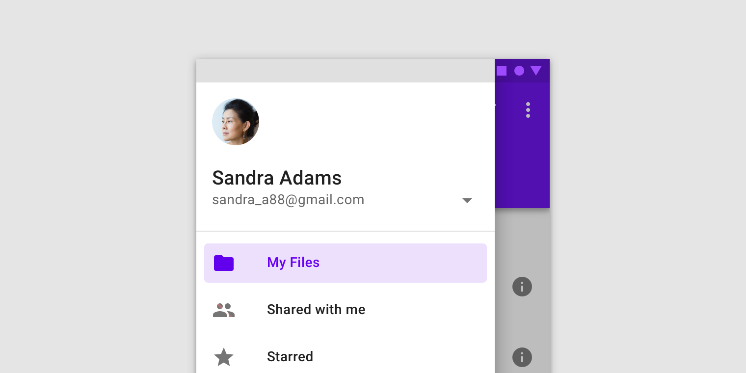
Source code for the Final Version
 waseefakhtar
Awesome that you came this far! 👏 Now I'd love to know what the most annoying part of this post was or if it was of any help to you. Either ways, you can drop me a DM on: www.twitter.com/waseefakhtar ✌️