Android Material Component: Navigation Drawer Styling (Part III)
In this post of the series, we’re looking at how to add and style the header view of the NavigationDrawer.


In Part II, you’ve looked in to how to add color states for navigation menu items and adding shapes as background for the menu items. In this post of the series, we’re looking at how to add and style the header view of the NavigationDrawer. But first, here’s how far we’ve come since the original post.
Previous Posts
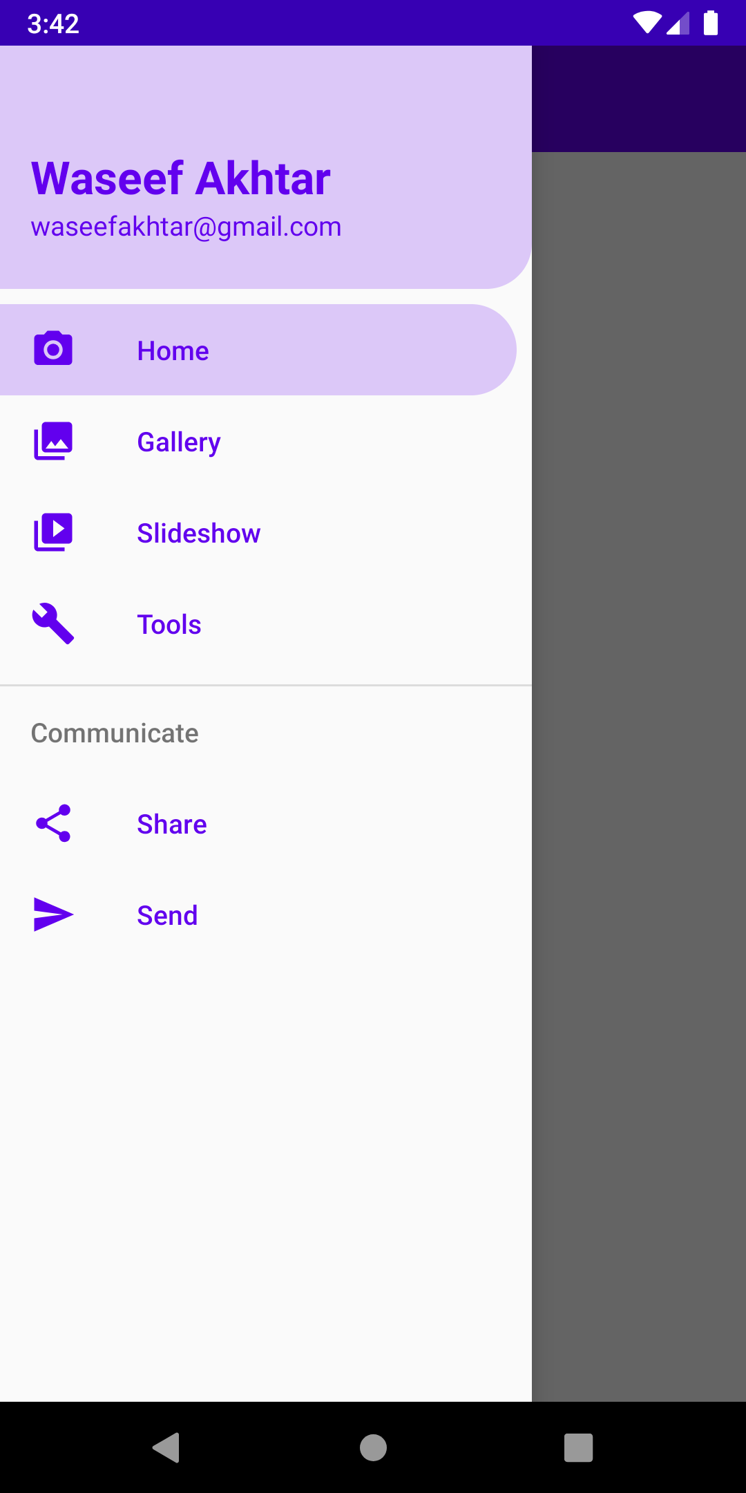
 Waseef Akhtar
 Waseef Akhtar
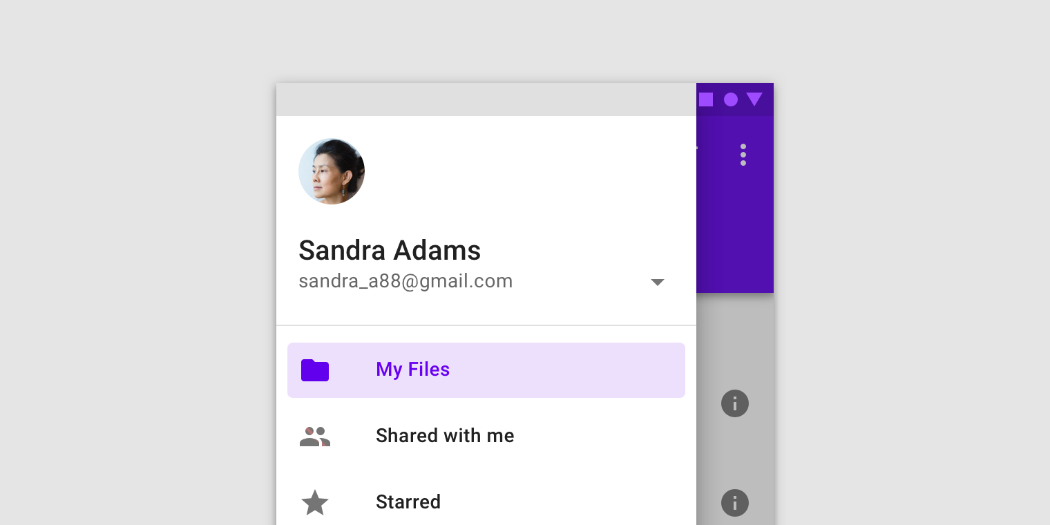
Note
In addition to styling, this tutorial also provides the best practices of using colors and resources, i.e. via attributes like ?attr/ and never on the UI component directly but through styles.
- The advantage of using
?attr/in calling colors and color states is because of reasons like making it generic so it’s easy for us to either change our brand colors in the future, so adding a new theme for our app (for instance, to support Dark/Light mode) - The advantage of using styles is to unify the styles for each UI element so every time you add a new UI element (for instance, a Button or a TextView), you can call a style to apply all the UI changes for that element you’ve applied in other places.
To read more about themes and styles, please go to these wonderful articles by Nick Butcher:
 Nick Butcher
 Nick ButcherNick Butcher
Implementing: headerLayout
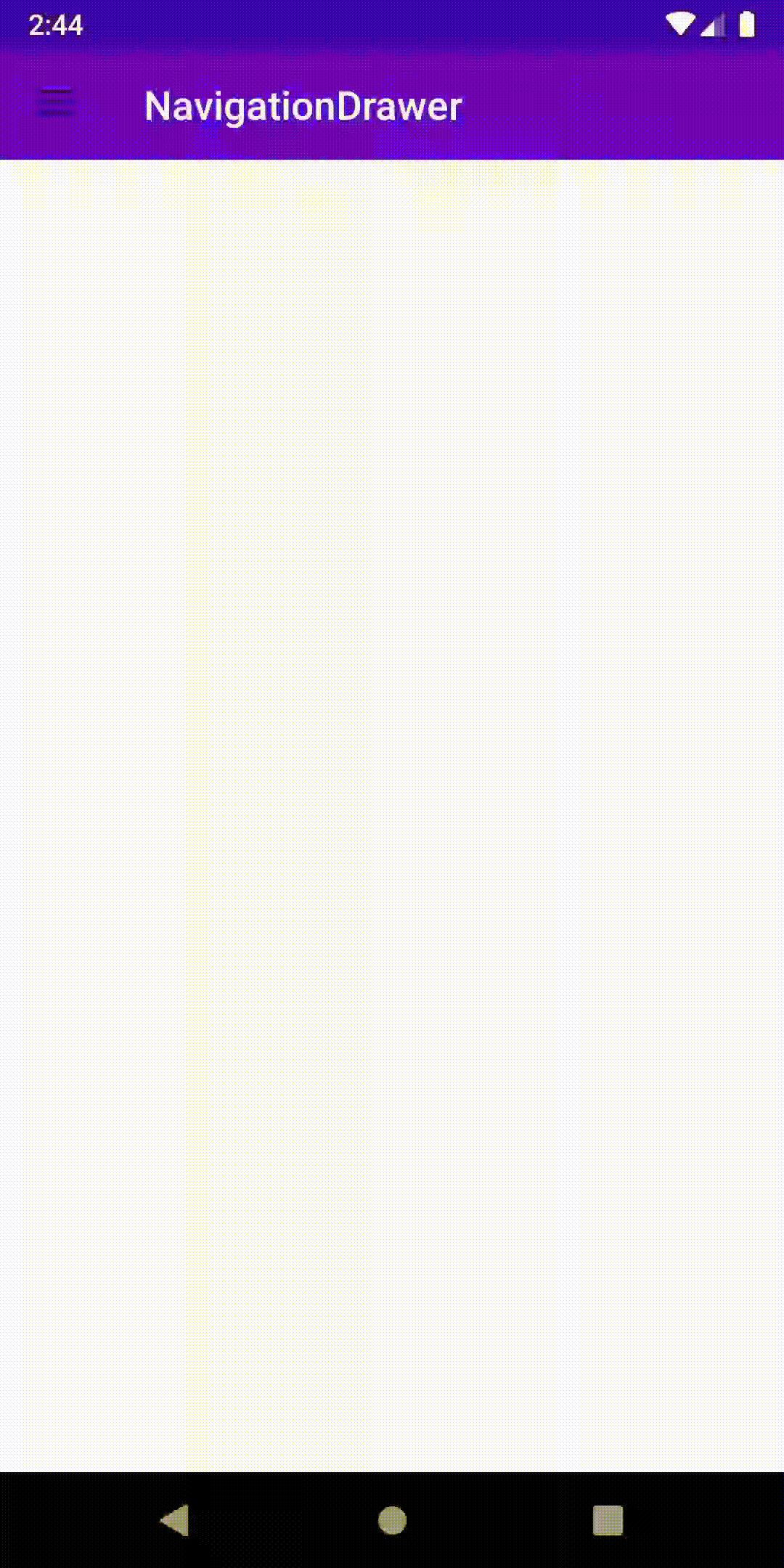
If you’ve noticed, we currently show a solid purple color for the menu item background color. But there’s a possibility that we can add our own shape as the background. In order to do so:
- Add a new Drawable Resource File, name it
round_top_background.xmland the following lines:
2. Create a new Layout file, name it nav_header_main.xml and add the following lines:
3. Finally, set the headerLayout in the NavigationView in activity_main.xml:
4. And run the app.
With everything in line, you should now finally see your screen as the one below:
Source code for the Final Version
 waseefakhtar
As always, let me know if my tutorial helped you in anyway and the things I can improve in writing tutorials by sending a DM or a Tweet at: twitter.com/waseefakhtar ✌️