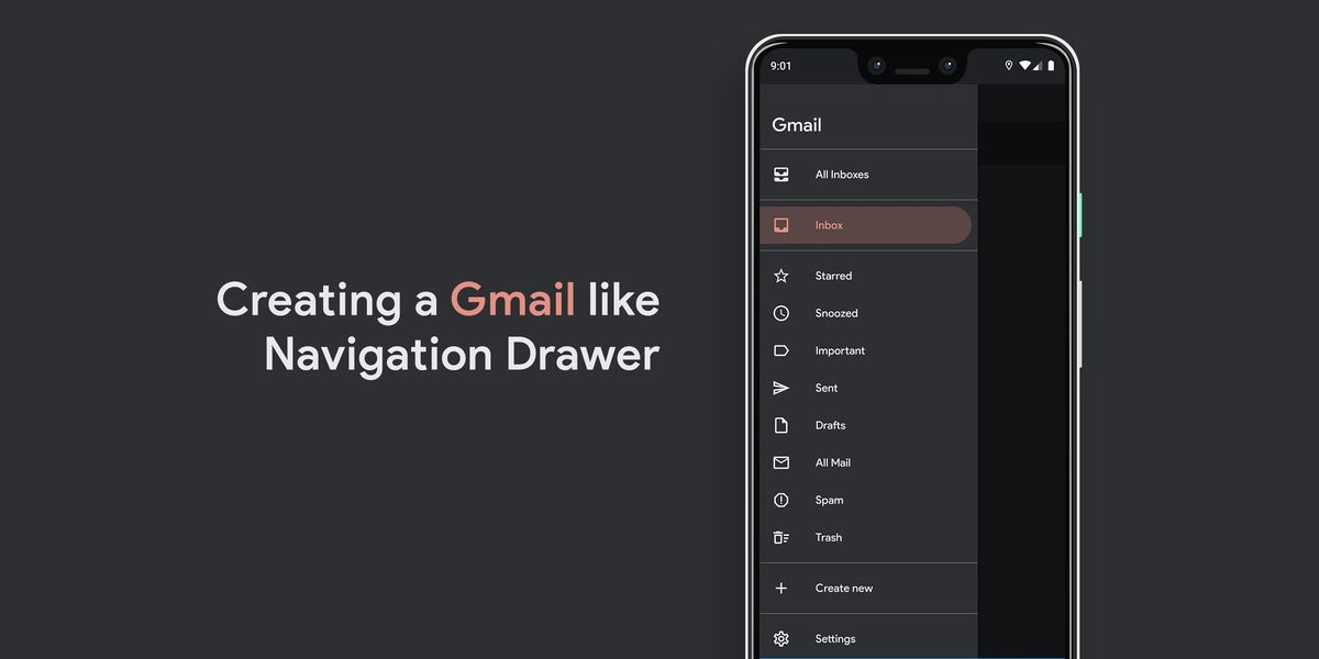
Android Material Component: Creating a Gmail like Navigation Drawer (Part I)
I think that when you know exactly what you want to create, you tend to explore the component so much better. In this case, we’re creating a Gmail like Navigation Drawer while also keeping the blogpost short.

If you’ve been following my blog for a while, chances are, you might have passed by my blog posts regarding an easy approach to Navigation Drawer and styling it:
 Waseef Akhtar
 Waseef Akhtar
Since those posts are more thorough, I know that it’s intimidating to consume so much knowledge all at once. And I know that because I received a few DMs asking about styling specific elements in the Navigation Drawer after those posts.
Also, a personal opinion: I think that when you know exactly what you want to create, you tend to explore the component so much better. In this case, we’re creating a Gmail like Navigation Drawer while also keeping the blogpost short (for the reasons mentioned above).
So if there’s anything that you think is missing from this post, please refer to the posts linked above.
If you follow along, you’ll have a final screen looking like this:
Let’s get started
Prerequisite ☝️
For this post, we’ll assume you already have a Navigation Drawer set up. If not, you can set it up with the help of the following post:
Waseef AkhtarAdd Gmail assets 🎨
There are two things to set up before styling our Navigation Drawer to get the look and feel of the Gmail app:
Brand colors
- Open
colors.xmland add the following colors:
2. Open styles.xml and add the following items in your base theme:
Font family
- Create a new directory under res with the name font.
- Download Google Sans font from here.
- Add the Medium weight font inside the res/font directory.
- In your
styles.xml, add the newly added font inside your base theme as:
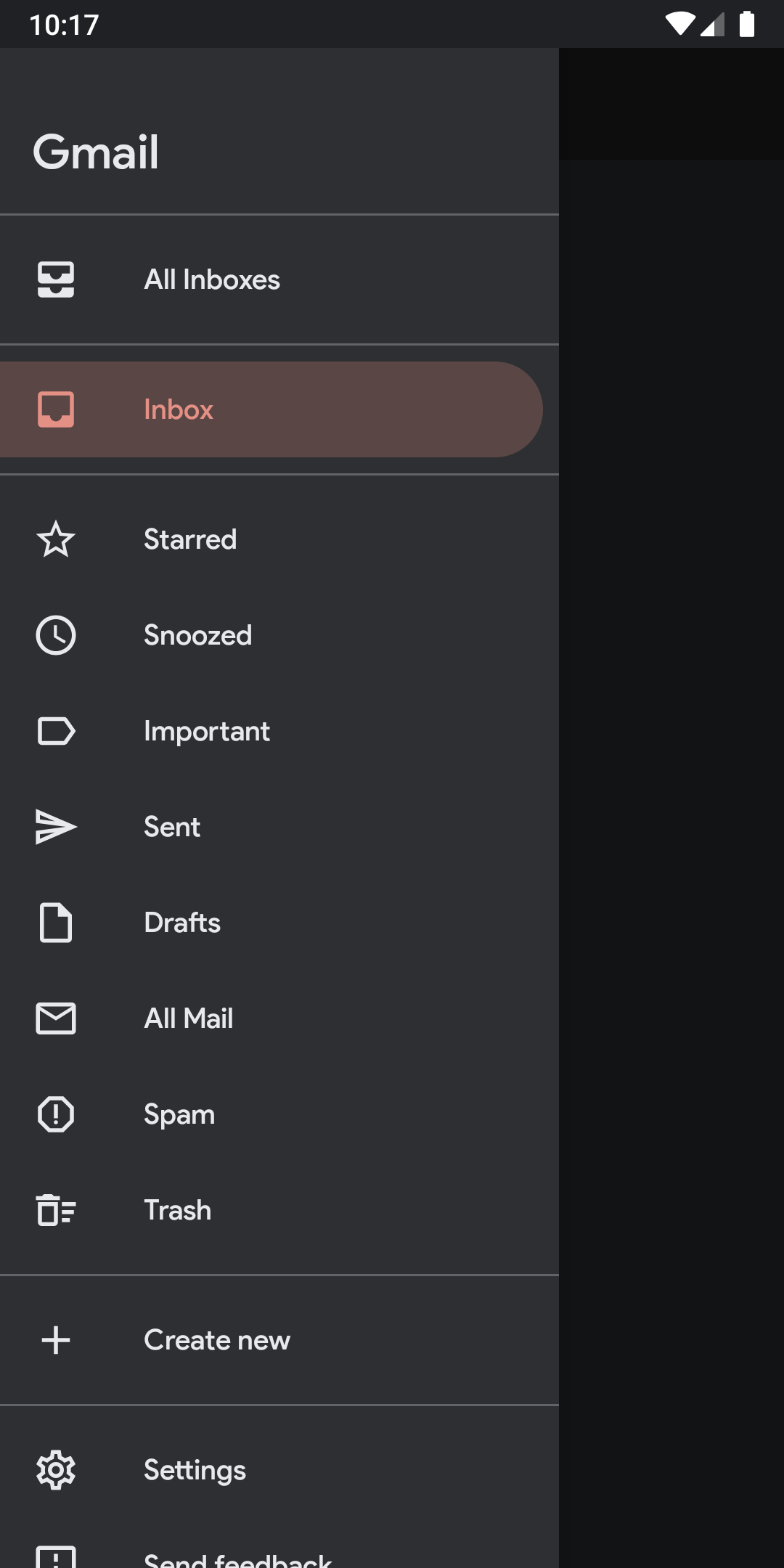
Running the app at this stage will look like this:
Styling 👨🎨
Although it is easy to style Navigation Drawer by setting custom color, color states, and drawables to an individual NavigationDrawer for a simple app like we’re building, we’ll follow the best practices to get the hang of how styling is done in a real app.
To begin styling:
- Open
values/attrs.xmlor if you don’t have it already, create it. - Add the following attributes:
Note: Adding these attrs make it easy to add color and color states to our Navigation Drawer through styles.xml so when we need to change our branding in a real app or support both dark/light version of the app, we can only head to styles.xml and change the color and color states of these attributes there
3. Add a new drawable under res/drawable with the name background_round_padded_selected and the following lines:
4. Add another drawable under res/drawable with the name background_round_padded_pressed and the following lines:
Note: These drawables are used as the states for Navigation Drawer item background for either when they’re pressed or selected.
5. To add the color states for the item background, create another drawable under res/drawable with the name menu_item_background_color_state.xml and add the following lines:
6. Now under res/color, add a new color state (used for item text and item icon) with the name menu_item_color_state.xml and the following lines:
Note: Make sure to follow that each XML go in the correct directory i.e.menu item background shape and states go under res/drawable and menu item states go under res/color
7. Now that the styles are set, open styles.xml and add the following lines in your base theme:
8. Create two more styles for Navigation Drawer below your base theme, like so:
9. Finally, open activity_main.xml and add the style attribute to the Navigation Drawer, like so:
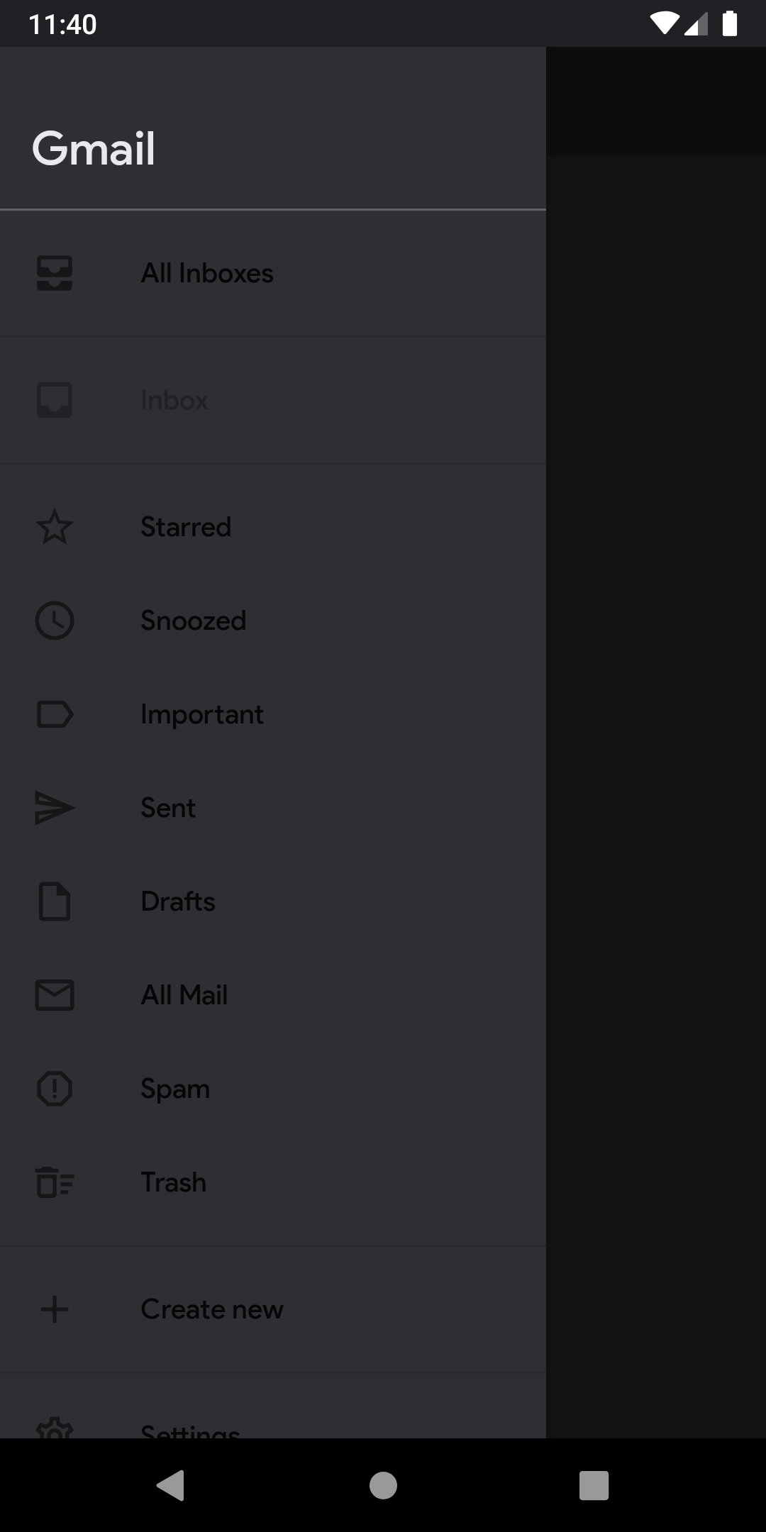
Run the app now and voilà! 🎉 Here’s your newly designed Gmail like Navigation Drawer:
Happy coding! 💻
Up Next
Waseef Akhtar
Source code for the Final Version
 waseefakhtar
TL;DR
Code snippet on how to create a Gmail like Navigation Drawer in three easy steps:👇
— Waseef Akhtar (@waseefakhtar) May 30, 2020
1. Create a round cornered shape.
2. Use it in a new state list for when an item is selected.
3. Set the app:itemBackground as the new state list. 🎉#AndroidDev #MaterialDesign #100DaysOfCode pic.twitter.com/DKjgwRA3gx
Have something to say? Leave me comments on Twitter, retweet, like or follow: ✌️
I just published "Android Material Component: Creating a Gmail like Navigation Drawer" https://t.co/kvUyGfV12e#AndroidDev #MaterialDesign #Kotlin #100DaysOfCode #AndroidDevelopment
— Waseef Akhtar (@waseefakhtar) May 31, 2020
If you enjoyed this, you might also be interested in other stories that I recently published:
Waseef Akhtar